

Table of contents
- AI adoption benchmarks
- Workday pattern benchmarks
- Focus, collaboration and multitasking benchmarks
- Underutilization and disengagement risk benchmarks
- Overutilization and burnout risk benchmarks
- Weekend work benchmarks
- Remote work benchmarks
- Hybrid and in-office benchmarks
- Go deeper with the 2026 State of the Workplace report
ActivTrak’s fifth annual State of the Workplace report is full of surprises.
AI is clearly changing work. The average workday is faster, more fragmented and less focused than ever. But what do the findings mean for your teams? In our new companion guide series, we’ll walk through 440+ million hours’ worth of work data to show how to apply the findings to your workforce — one step at a time.
You’ll learn:
- Which ActivTrak reports to pull
- How to compare your workforce data to this year’s benchmarks
- What the numbers tell you — and what to do next
Remember: The benchmarks below reflect observed behavior at a point in time — not a standard to hit or avoid. Industry, customer coverage requirements and team norms vary significantly, and all of those factors shape what a typical workday looks like for any given organization.
(New to ActivTrak? Sign up for a free trial to start collecting data and gain full access for 14 days.)
AI adoption benchmarks
First, we’ll look at the latest AI adoption trends to answer three critical questions.
1. How many AI tools do your teams use?
The finding: AI tool sprawl is now the norm.
By early 2025, more than 95% of companies of all sizes — from small business to enterprise — had adopted AI to some degree. The average organization now uses 7 AI tools, up from just 2 in 2023, and 83% of organizations use 6 or more. In other words: It’s no longer a question of if your employees use AI, but how many AI tools they use.
Why it matters: More tools don’t mean more impact.
Instead of consolidating around a few trusted platforms, most organizations are experimenting with many. More than 90% apply AI to at least one business function, but only one-third use it to create new products or reinvent processes. And 37% still use AI at a surface level, with little change to how work gets done.
You need to understand how many AI tools your employees already use to lay the foundation for answering bigger questions such as:
- Which tools actually drive productivity?
- Where is time saved (or added)?
- How do you standardize usage across teams?
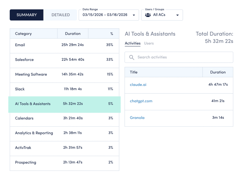
How to compare your data: Use ActivTrak’s Category Usage dashboard:
- Navigate to Technology & AI Usage > Category Usage.
- Select AI Tools & Assistants to pull up a list of tools your employees currently use.
How to interpret the data:
- If you see less than 6 AI tools: A low tool count can mean two things: You’re either in early experimentation, or you’ve deliberately narrowed your stack to what works. If it’s the former, focus on identifying high-value use cases before expanding. If it’s the latter, shift to deepening usage and measuring impact from the tools you have.
- If you see 6-7 tools: You’re aligned with the current benchmark. This means it’s time to build AI into day-to-day operations. Identify which tools drive value, then integrate them into workflows.
- If you see more than 7 tools: Your AI tool count is high. While this may indicate early adoption, there’s also a risk of inefficiencies caused by rapid tool sprawl. Look for opportunities to consolidate around platforms that show measurable impact. Identify where overlap exists, where tools lack clear ownership and which platforms actually drive impact.
2. What are the top most-used AI tools?
The finding: One tool dominates, but the market is fragmenting.
ChatGPT leads by a wide margin — used 27x more than the next most-used AI tool (Cursor). Chatgpt.com is also the fifth most-used business website, up from #19 in 2024, with a 145% year-over-year increase.
Why it matters: Usage patterns shape your AI strategy.
The tools your employees use most aren’t random. They signal where AI fits into workflows today and where governance needs to catch up. While 75% of CEOs say trusted AI is impossible without effective AI governance, only 39% have a good governance strategy in place today. Knowing which tools your teams use allows you to set clear policies for AI usage.
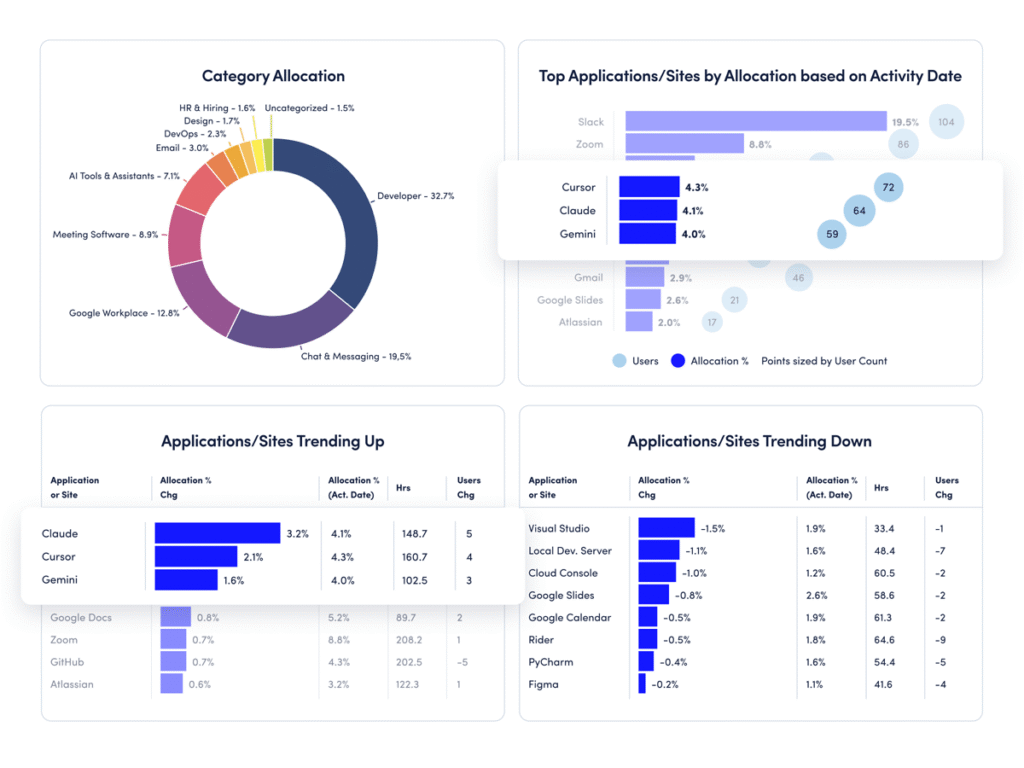
How to compare your data: Use ActivTrak’s Technology Utilization dashboard:
- Navigate to Executive Summaries > Technology Utilization.
- View the “Top Applications/Sites by Allocation” report to identify most-used AI apps.
- Click “Top Changes” in the upper left to see AI tools trending up (and down).
How to interpret the data:
- If usage is concentrated in 1-3 tools: You have a clear starting point for standardization. Focus on formalizing how teams use these tools — define clear use cases, provide targeted training and set expectations for where AI fits into daily work.
- If usage is spread across many tools: This may limit consistency. Define preferred tools and set realistic productivity benchmarks tied to actual outcomes.
- If new tools appear frequently: Adoption is happening organically. It’s time to establish guardrails before experimentation solidifies into habits.
3. How much time do employees spend on AI tools?
The finding: Most employees rarely use AI.
Despite rapid advancement, the reality is that the largest segment of AI users (57%) spend less than 1% of their total work time in AI tools. Only a small group has reached the productivity sweet spot — spending 7% to 10% of their time using AI.
Why it matters: Adoption without depth limits impact.
While most organizations have crossed the adoption threshold, few are operationalizing AI in meaningful ways. And this is where the real value lives. The data shows AI doesn’t reduce work — it amplifies it. So if most employees still spend less than 1% of their time in AI tools, you have untapped capacity sitting in plain sight.
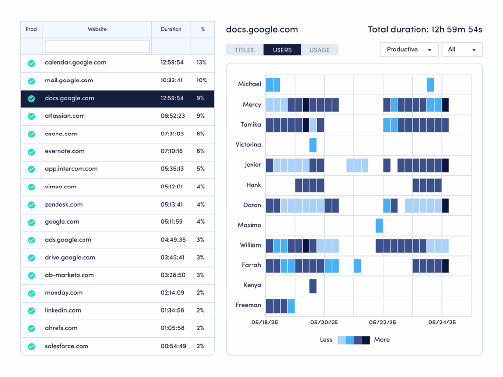
How to compare your data: Use ActivTrak’s Website Usage and Application Usage dashboards:
- Navigate to Technology & AI Usage > Website Usage and Application Usage.
- Change the date range to the last 30 days.
- Note the percentage for each AI website or app.
How to interpret the data:
- If most employees are below 1%: You’re in early adoption. Focus on identifying repeatable use cases that save time.
- If employees are in the 1% to 6% range: Usage is growing but not yet optimized. Provide training tied to real workflows.
- If usage exceeds 10%: Watch for diminishing returns. Ensure AI use aligns with outcomes, not just activity.
- If employees are in the 7% to 10% range: You’ve reached the productivity sweet spot. Now define benchmarks and scale best practices.
Pro tip: Use ActivTrak’s AI Insights add-on to measure AI adoption maturity and see where your AI tools drive real productivity gains.
Workday pattern benchmarks
Next, see how your ActivTrak data compares to workday benchmarks by answering four questions:
1. How long is the average workday at your organization?
The finding: The workday is getting shorter — but that doesn’t mean less work.
The average workday declined from 8 hours 53 minutes in 2023 to 8 hours 44 minutes in 2025 — a 2% drop. On the surface, that looks like less work. But the reality is more nuanced. Work that once fit inside a fixed block is now spread across more flexible windows, often extending into early mornings and weekends when there are fewer interruptions.
Why it matters: Shorter days signal a shift in how work happens.
Shorter workdays often point to high efficiency, either because teams get more done in less time or spread work over more days. At some organizations, this shift includes Saturdays and Sundays. In a subset of employees who work weekends, many now devote 8 to 9 hours of their weekends to work — and they’re getting a lot done during that time. Saturday productive time increased 46%, while Sunday’s jumped 58%. And that’s not a small group logging extra hours. It’s a consistent, multi-year shift in how work fits into life.
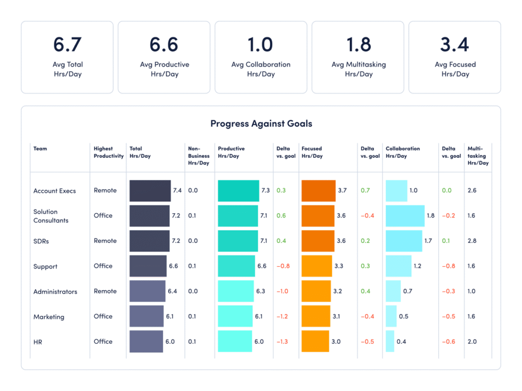
How to compare your data: Use ActivTrak’s Team Comparison dashboard:
- Navigate to Executive Summaries > Team Comparison.
- Change the Date Range to “Year to Date” and view the Screen Time Hrs/Day.
How to interpret the data:
- If employees work more than 8 hours 44 minutes: Your employees work exceptionally long days. This metric includes all work, including multitasking and busywork as well as productive time, and may signal hidden inefficiencies — meetings that run long, frequent interruptions or unclear priorities. Look for opportunities to streamline workflows and minimize distractions.
- If employees work significantly less than 8 hours 44 minutes: Your employees work shorter days compared to the current average. This could mean your teams are highly efficient. Or they may be at risk of underutilization and disengagement. If it’s the former, continue to provide support so they stay productive. If you’re concerned about the latter, revisit number two in the series intro to investigate further.
- If employees work close to 8 hours 44 minutes: You’re aligned with the current benchmark. The next step is optimizing how people use that time. Look beyond total hours to patterns across days and weeks to understand if work is shifting outside traditional schedules. And remember: Longer isn’t always better. Total screen time includes busywork and multitasking as well as productive time, and it’s important people aren’t putting in extra time unnecessarily.
2. When do employees start working?
The finding: Work is shifting to earlier.
Most employees now log in by 7:48 a.m., compared to 8:02 a.m. in 2023. That shift may look minor, but at scale it signals something bigger. This data suggests the workday is no longer anchored to a single, standard start time — yet another indication employees are taking advantage of flexible schedules to start when they have the most quiet or control over their day.
Why it matters: Start times show how much flexibility your employees have, and if they take advantage of it.
Start times are an important signal you shouldn’t ignore. They tell you a lot about employee preferences and productivity. For some, an earlier start allows for uninterrupted work before meetings begin. For others, it reflects a need to get work done before school drop-offs, commutes or personal obligations.
It’s important to pay attention to when your employees start their days, so you can adjust policies as needed. Surveys indicate at least 40% of employees will job hunt if they don’t get the flexibility they need — a finding that applies to in-office employees as well as hybrid and remote teams. In fact, 53% of fully in-office workers want flexibility in where and when they work.
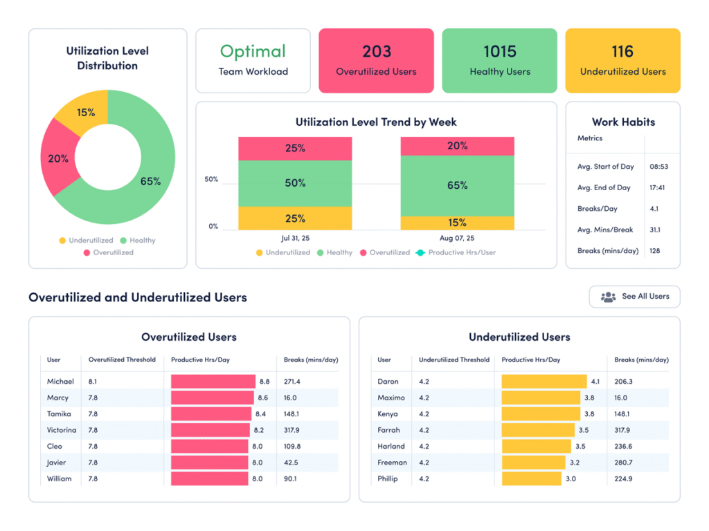
How to compare your data: Use ActivTrak’s Workload Balance dashboard:
- Navigate to Productivity Optimization > Workload Balance.
- Change the Date Range to “Last 365 Days.”
- Check the “Work Habits” column to view average start and end times.
How to interpret the data:
- If employees start much earlier than 7:48 a.m.: Your workforce may be leaning into flexibility in a healthy way. This is especially true if earlier starts are paired with strong productive time, reasonable end times and healthy utilization. (These metrics are also available in the Workload Balance dashboard.) But if early starts also come with long days, frequent weekend work or high overutilization, the pattern may indicate a need to redistribute work.
- If employees start much later than 7:48 a.m.: A later start is not a problem by itself. It may reflect your industry, customer coverage needs or team norms. If your Workload Balance dashboard is predominantly green, your schedule may already fit the business. If not, run a test to see if a quieter early window for focused work improves productivity.
- If employees start close to 7:48 a.m.: You’re aligned with the benchmark. This suggests your team’s habits match broader workplace patterns. The next step is to look past the average and identify which groups get the best results from their schedules. Compare start times with productivity trends and focus time to see whether schedule flexibility is improving outcomes or just shifting hours around.
3. How many hours a day are your employees productive?
The finding: Productivity is rising, even as the workday shrinks.
While workdays are shorter, overall productivity is up. Employees now average 6 hours 36 minutes of productive time per day — a 5% increase from 2023 to 2025. This is a strong indication that employees are more intentional about how they spend their time, even as total hours decline.
Why it matters: Working smarter is the goal, but many employees still face pressure.
More productive time in fewer hours signals clearer priorities and more efficient workflows. However, there’s a catch. More productivity doesn’t mean less stress or greater well-being. Nearly 40% of employees feel pressure to increase productivity due to rapid changes and shifting workloads. The data suggests that pressure often shows up as fragmented workdays — bursts of productivity sandwiched between multitasking and interruptions. It’s important to look at the big picture.
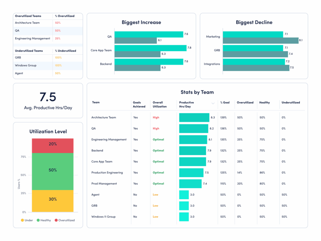
How to compare your data: Use ActivTrak’s Organization Insights dashboard:
- Navigate to Executive Summary > Organization Insights.
- Change the Activity Period to “Last 30 Days” and look at the Avg Productive Hrs/Day column.
How to interpret the data:
- If average productive hours are above 6 hours 36 minutes: Higher productive time may indicate strong performance, or it might signal pressure or overutilization. Look deeper. Are employees maintaining healthy focus time and reasonable work hours? Or is productivity driven by longer days and constant activity? Sustainable productivity should not come at the cost of burnout.
- If average productive hours are below 6 hours 36 minutes: Lower productive time may point to inefficiencies such as excessive meetings, unclear priorities or time lost to low-value tasks. Identify where work is breaking down. Then look for opportunities to reduce friction, whether that’s streamlining workflows or clarifying expectations.
- If average productive hours are close to 6 hours 36 minutes: You’re aligned with the current benchmark. The next step is optimization. Break down productive time by team, role or work pattern to identify where performance is strongest — and where to improve. Focus on increasing the quality of work time, not just the total amount.
4. How long do your employees work without disruption?
The finding: Overall productivity is improving.
Productive session length — the amount of time employees work without interruption — increased 13% to 27 minutes 30 seconds. This means individual bursts of disruption-free work are getting longer. Rather than working longer hours, employees are finding ways to work more intentionally.
Why it matters: Focus is the foundation of productivity.
Long productive sessions show employees have the space to think, execute and make progress without constant disruption. Protecting them is one of the best ways to improve output without increasing workload. Yet nearly half of employees say their work feels chaotic and fragmented, making this a critical metric to monitor.
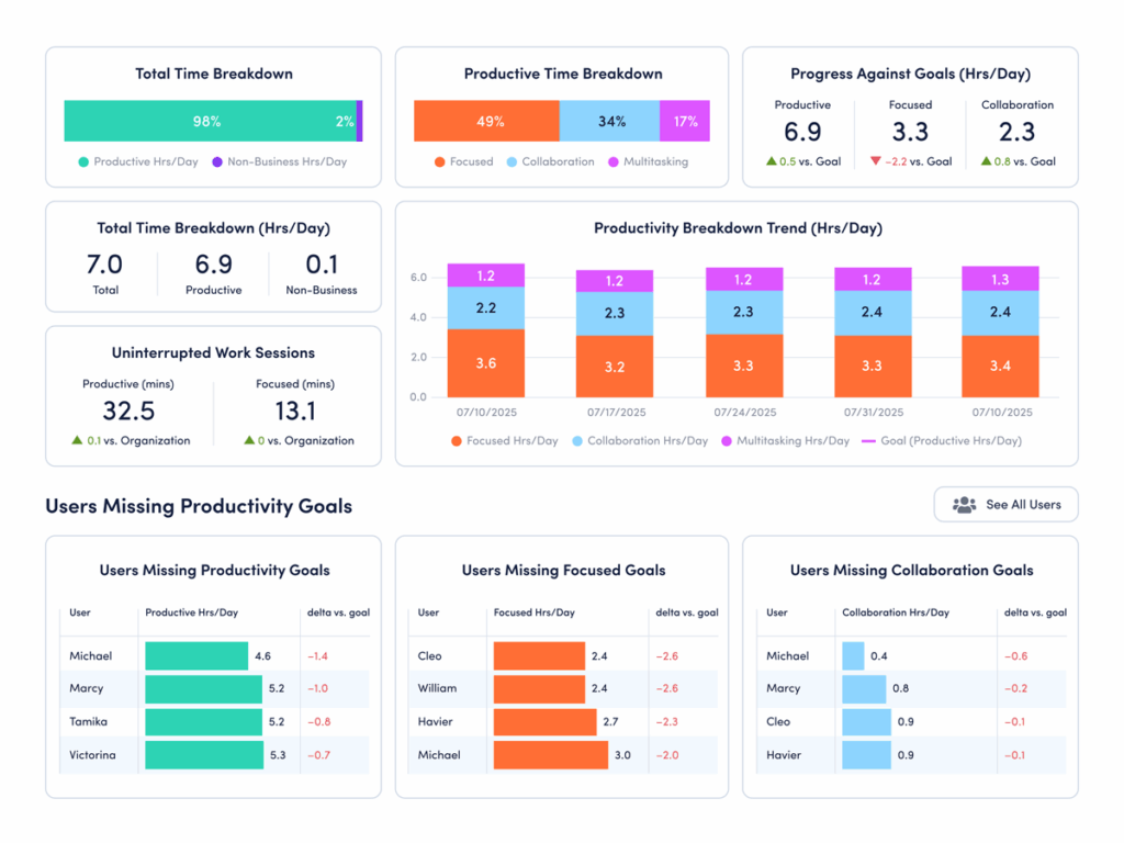
How to compare your data: Use ActivTrak’s Focus & Collaboration dashboard:
- Navigate to Productivity Optimization > Focus & Collaboration.
- Under “Uninterrupted Work Sessions,” look at “Productive (mins).”
How to interpret the data:
- If productive sessions are significantly higher than 27 minutes 30 seconds: Your teams likely have strong focus habits. That’s a competitive advantage. The next step is to protect it. Identify what’s enabling long productive sessions — whether it’s disciplined meeting schedules, async communication or workload balance — and reinforce those behaviors across teams.
- If productive sessions are significantly lower than 27 minutes 30 seconds: Your teams may face frequent interruptions. Dig deeper to see if excessive meetings, constant messaging or unclear priorities are keeping employees from making meaningful progress. Reducing even a small number of disruptions helps improve efficiency.
- If productive sessions are in the range of 27 to 30 minutes: You’re operating within a strong benchmark range. Now focus on consistency. Identify which teams or roles achieve the longest uninterrupted sessions and replicate those conditions more broadly. Small gains in productive time compound quickly across the workday.
Focus, collaboration and multitasking benchmarks
Looking at how much time teams spend in specific activities is another set of critical benchmarks to compare.
1. Do your employees stay focused and on task?
The finding: Overall productivity is up. But focus is down.
The average employee is productive for 6 hours 36 minutes a day — a 5% increase from 2023 to 2025. But at the same time, the average focus session length dropped 9% to just 13 minutes 7 seconds. This means employees stay on task for less than 14 minutes before a ping, chat, email, meeting or other distraction interrupts them.
Why it matters: This focus fragmentation is not sustainable.
While the productivity gains are real, the rise of multitasking and context switching threatens to erode them. Most employees are interrupted 275 times a day, and more than half say distractions are the biggest barrier to getting work done.
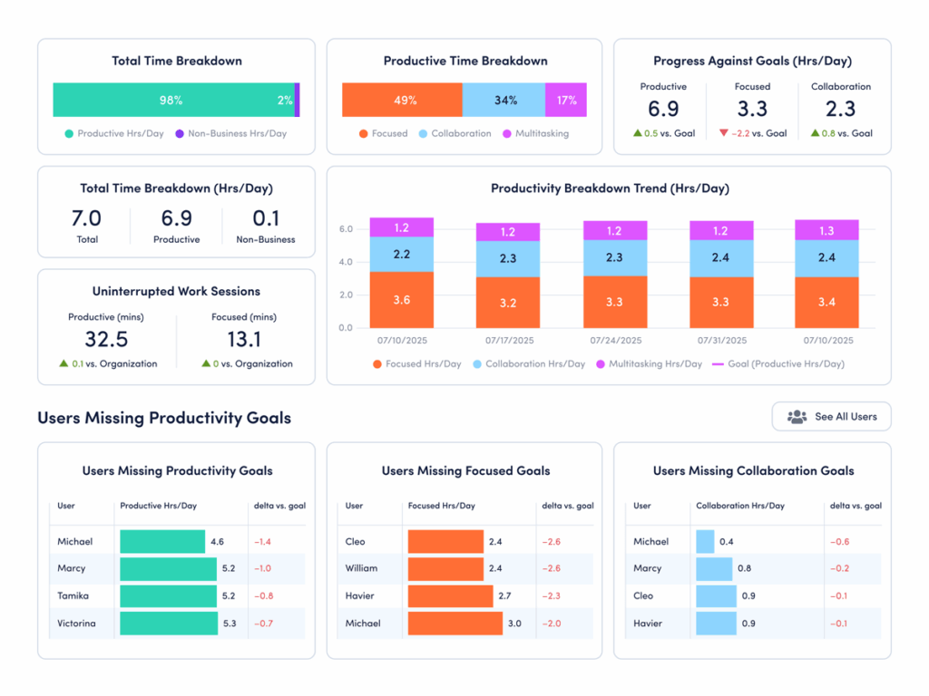
How to compare your data: Use ActivTrak’s Focus & Collaboration dashboard:
- Navigate to Productivity Optimization > Focus & Collaboration.
- Under “Uninterrupted Work Sessions,” look at “Focused (mins).”
How to interpret the data:
- If focused minutes are significantly above 13.7: Congrats! Your employees have longer uninterrupted work sessions than the current benchmark. This indicates a healthy balance of collaboration and deep work. Protect it. Look at meeting schedules, notification settings and expectations for how quickly people respond. This helps ensure interruptions don’t slowly creep in.
- If focused minutes are significantly below 13.7: Your teams likely struggle with frequent interruptions. Start by identifying where attention breaks down — meetings, messaging tools or constant app switching. Then experiment with protected focus blocks, fewer recurring meetings and clearer expectations on how quickly to respond.
- If focused minutes are in the range of 13 to 14 minutes: Your organization sits close to the current benchmark. However, the new average of 13 minutes 7 seconds is still a concerning drop from previous years in our study. Look at this as an opportunity to change course before distractions continue to increase.
Pro tip: For another view, navigate to Technology & AI Usage > Website Usage and Technology & AI Usage > Application Usage. If collaboration tools like Slack, Teams, Zoom, Google Calendar and Outlook top the lists, this is a sign your employees spend a lot of time in a distracted state.
2. How much time do your teams spend collaborating?
The finding: Collaboration time is taking up a larger share of the workday.
Collaboration time — the time employees spend in meetings, chat tools and messaging apps — increased 34% to 52 minutes per day. That now represents 13% of all productive time, up from 10% in 2023. On its own, that may not raise concerns. Collaboration is essential to how work gets done. But this steady increase signals a shift. More of the workday is now spent coordinating, aligning and responding, leaving less time for focused execution.
Why it matters: More collaboration isn’t always better.
Collaboration helps teams stay connected and move work forward. But too much drains productivity. Ineffective meetings fragment the workday, while constant messaging interrupts focus. Over time, these office disruptions block meaningful progress. The result is often workdays that feel busy but ineffective.
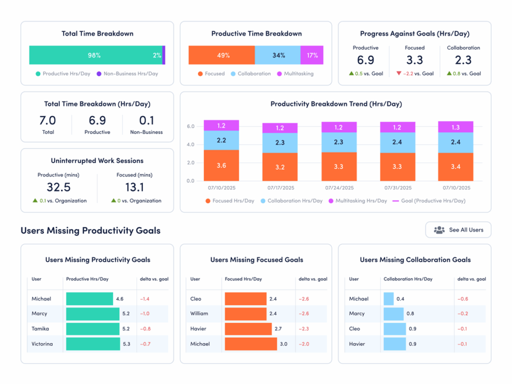
How to compare your data: Use ActivTrak’s Focus & Collaboration dashboard:
- Navigate to Productivity Optimization > Focus & Collaboration.
- Change Activity Date to “Last 90 Days.”
- Under “Productive Time Breakdown,” hover over the bar chart to see the average number of daily hours your employees spend on collaboration.
How to interpret the data:
- If collaboration time is significantly higher than 52 minutes/day: This is above the current benchmark and may support alignment. But are your teams sacrificing needed focus time for meetings and messaging? Look closer at how that time is spent. If collaboration continues to rise alongside multitasking or longer workdays, it may be time to streamline communication and protect focus time.
- If collaboration time is significantly lower than 52 minutes/day: This is below the current benchmark, but lower collaboration time isn’t automatically a problem. It may reflect efficient async workflows or roles that require deep, independent work. Or it might signal gaps in communication. Compare collaboration time with outcomes. If productivity or engagement is lagging, your teams may need more structured touchpoints.
- If collaboration time is in the range of 50-60 minutes/day: You’re operating within the current benchmark range. However, it’s important to remember that the appropriate amount of collaboration time varies by industry, team norms and business goals. Assess the quality of that time to identify which types of collaboration drive results — and which create noise. Then refine your approach to ensure conversations support progress without disrupting it.
3. How much time do your teams spend multitasking?
The finding: Employees are multitasking more than ever.
Multitasking rose 12% to 1 hour 33 minutes per day. In 2025, every quarter recorded higher multitasking than any quarter in 2023 or 2024. This isn’t an isolated spike — it’s a sustained trend. Employees spend more time switching between tasks, tools and conversations, often in quick succession throughout the day.
Why it matters: Too much multitasking reduces focus and slows meaningful progress.
Multitasking may feel productive but often has the opposite effect. Frequent task switching breaks concentration and makes it harder to complete high-value work. Whether it’s messaging during a meeting or chatting while tackling an important task, each context switch creates a reset point that slows momentum. The result is often longer completion times, more errors and a workday that feels fragmented. Employees stay busy but struggle to make consistent, meaningful progress.
How to compare your data: Use ActivTrak’s Focus & Collaboration dashboard:
- Navigate to Productivity Optimization > Focus & Collaboration.
- Change Activity Date to “Last 90 Days.”
- Under “Productive Time Breakdown,” hover over the bar chart to see the average number of daily hours your employees spend multitasking.
How to interpret the data:
- If multitasking is significantly higher than 1.5 hours a day: This is above the current benchmark for interruptions and context switching. This might signal a work environment where frequent messages and shifting priorities make it hard to stay focused. Look for the sources of disruption. Are employees juggling too many tools or conversations at once? Are priorities unclear? It might be time to reduce unnecessary touchpoints and create more space for focused work.
- If multitasking is significantly lower than 1.5 hours a day: Less multitasking may indicate a more focused, structured work environment — especially if your productive hours are high. But it’s worth validating. In some cases, low multitasking may reflect limited collaboration or slow response times. Compare this metric with collaboration and output to ensure teams stay aligned while maintaining focus.
- If multitasking is in the range of 1 hour 20 minutes to 1 hour 40 minutes per day: You’re operating close to the current benchmark. The next step is to look at consistency and impact. Identify which teams manage multitasking well — maintaining productivity without constant disruption — and which struggle with fragmented work. Small reductions in task switching often lead to meaningful performance gains.
Underutilization and disengagement risk benchmarks
For years, leaders worried about burnout. Now, organizations face a different issue. As AI usage increases, are employees underchallenged? ActivTrak makes it easy to spot underutilization and disengagement by answering three critical questions:
1. How many employees are in an underutilized state right now?
The finding: Underutilization is declining — but it still affects nearly 1 in 5 employees.
Underutilization dropped to 18%, down from 22% in 2023. This is a win. It means fewer employees are working below capacity. But this isn’t a metric to set and forget. As AI adoption changes how work gets done, it’s important to monitor this number quarterly.
Why it matters: Left unchecked, underutilization leads to disengagement.
When employees aren’t fully challenged, the impact builds over time. Skills go underused, motivation dips and work feels less meaningful. This often leads to disengagement — and eventually, turnover and attrition. At an organizational level, the effects show up as lower productivity, missed opportunities and declining team morale. Left unchecked, underutilization doesn’t just waste employee hours — it weakens performance across the business.
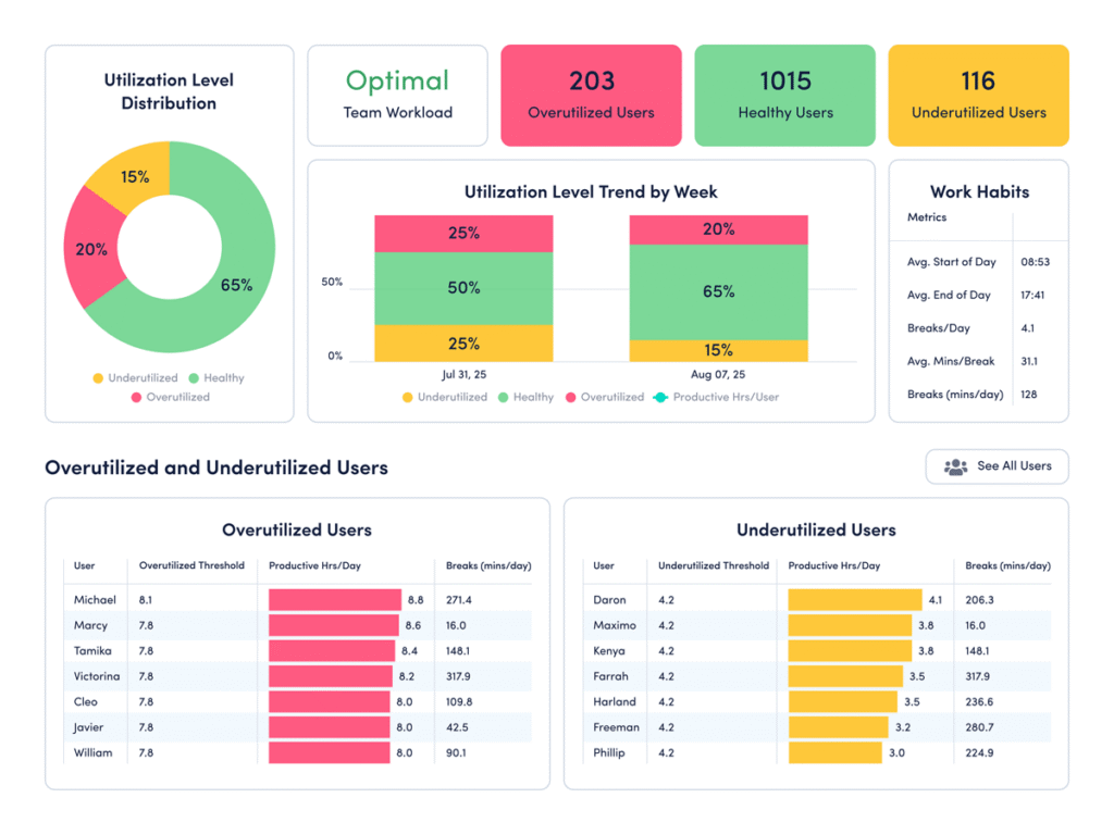
How to compare your data: Use ActivTrak’s Workload Balance dashboard:
- Navigate to Productivity Optimization > Workload Balance (or Insights > Workload Balance if you’re using legacy navigation).
- Change the Activity Date to “Last 90 Days.”
How to interpret the data:
- If significantly more than 18% of employees are underutilized: This indicates the number of under-challenged employees at your organization is above the current benchmark. Look for opportunities to close the gap. Do you need to balance workloads? Clarify priorities? Match employees to the proper roles? Find ways to put employee skills to use, then check again in a month.
- If significantly less than 18% of employees are underutilized: This suggests the majority of team members are currently engaged and well-balanced, especially if you have a high number of employees in the green “healthy” range. But it’s worth a conversation to confirm current workloads are sustainable. Balance is key.
- If 17-20% of employees are underutilized: You’re operating close to the current benchmark. However, it’s important to note that the current benchmark is only a general guidepost — and there’s always room for improvement. Identify which teams fall above or below this range and understand what’s driving the difference. Small shifts in workload distribution or role clarity often lead to meaningful improvements in engagement and output.
2. Do you have chronically underutilized employees?
The finding: A record number of employees are underchallenged.
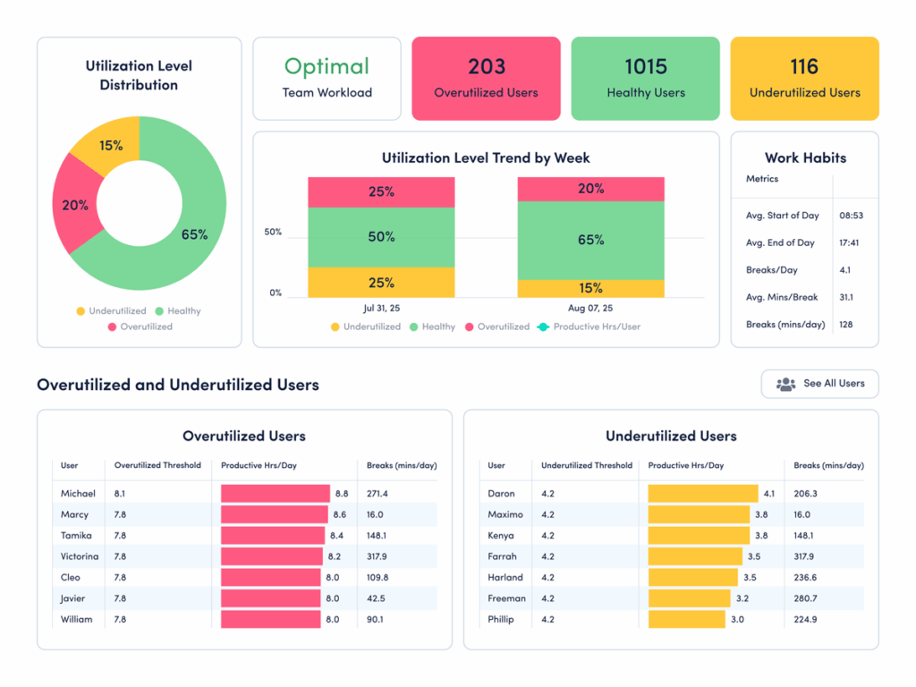
The good news? Only 5% of employees are at risk of burnout. While this is a big win, another silent productivity killer is taking its place. One in four employees spends more than 75% of the year in an underutilized state. They’re chronically under-challenged and under-deployed — two of the biggest predictors of disengagement.
Why it matters: Organizations that overinvested in alleviating burnout must now course-correct to prevent disengagement.
While burnout dominated post-pandemic workforce concerns, the data suggests it’s time to shift that conversation to underutilization and disengagement. Nearly 70% of U.S. employees say their skills go unused at work — a problem that consistently leads to high turnover. The resulting disengagement and attrition cost a median-sized S&P 500 company up to $355 million a year in lost productivity.
How to compare your data: Use ActivTrak’s Workload Balance dashboard:
- Navigate to Productivity Optimization > Workload Balance.
- Under “Activity Date,” set your filter to “Last 365 Days.”
How to interpret the data:
- If more than 23% of employees are underutilized: Don’t wait. This level of untapped capacity often leads to disengagement and turnover. Start by identifying where skills go unused. Then rebalance workloads, assign stretch projects or redirect talent to high-impact initiatives.
- If less than 23% are underutilized: Your teams are in a healthy utilization range. While some employees may need more challenges, work is largely aligned with employee skills. Continue watching the trend and look for ways to invest freed capacity in innovation, training or strategic projects.
- If 23% are underutilized: You’re aligned with the current benchmark. However, this still represents a meaningful amount of unused capacity. Even small improvements in workload alignment could unlock significant productivity gains.
Pro tip: Use Workforce Utilization to quantify the financial risk of untapped capacity in actual dollars.
3. How much could that untapped capacity cost you?
The finding: While overall underutilization is down, the number of chronically under-challenged employees is rising.
Nearly a quarter of employees across industries are chronically underutilized, which means they spend most of the year with extra hours to fill. Unlike short-term dips in workload, this reflects a sustained gap between what employees could contribute and what they’re actually doing.
Why it matters: Chronic underutilization poses a real financial risk.
Chronic underutilization isn’t just a productivity issue. When employees consistently operate below capacity, organizations pay for unused time. And the impact compounds. Research from McKinsey & Company shows the attrition tied to disengagement can cost a median-size S&P 500 company between $228 million and $355 million a year in lost productivity. What starts as unused bandwidth often leads to turnover, rehiring costs and missed growth opportunities.
How to analyze your financial loss risk: Use ActivTrak’s Workforce Utilization dashboard:
- Navigate to Executive Summaries > Workforce Utilization (or Insights > Financial Loss if you’re using legacy navigation).
- (Note: To first see how many employees are chronically underutilized, follow the steps in section 2 here.)
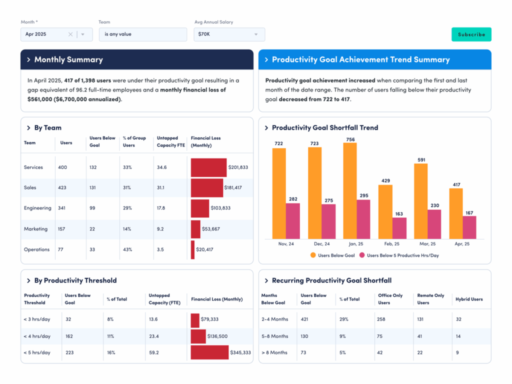
How to interpret the data: The Workforce Utilization dashboard quantifies untapped employee capacity in real dollars. This lets you see how much money your organization is leaving on the table from productivity losses. For example, if your average annual salary is $70,000 and 29% of your employees work below capacity, you’re looking at a monthly financial loss of $561,000 — or $6.7 million annually.
To analyze your current potential financial losses, look at:
- Monthly Financial Loss by Team to see which groups contribute most to lost productivity.
- Monthly Financial Loss by Productivity Threshold to see how much loss comes from employees working below expected capacity levels.
- Recurring Productivity Goal Shortfall to understand how often employees consistently miss utilization targets over time.
Overutilization and burnout risk benchmarks
While the latest data suggests burnout risk is down, it’s not gone. Work patterns continue to shift quickly and burnout levels can change just as fast. To help you stay ahead, let’s walk through how to use your ActivTrak dashboards to answer the two most important burnout questions right now:
1. How many employees are in the healthy range?
The finding: Most employees now have healthy work patterns, and that number is growing.
Healthy utilization reached a three-year high, with 75% of employees maintaining balance. This means most team members work at a pace that keeps them productive without feeling overworked or under-challenged. They have enough to do to stay engaged, but not so much the work becomes overwhelming. This is a strong signal of progress, but it’s also a moment to stay vigilant. As AI changes how work happens, utilization may shift quickly in either direction.
Why it matters: Balanced workloads drive both performance and well-being.
Balanced workloads directly impact how employees perform. When work is aligned with an employee’s capacity and skills, both productivity and well-being improve. Research shows employees are 13% more productive when they’re happy, with balance playing a key role. Regularly monitoring utilization helps you maintain that balance so employees stay engaged and productive. Even small changes in workload, priorities or team structure can move employees out of the healthy range.
How to compare your data: Use ActivTrak’s Workload Balance dashboard:
- Navigate to Productivity Optimization > Workload Balance (or Insights > Workload Balance if you’re using legacy navigation).
How to interpret the data:
- If 75% or more are in the healthy range: Congratulations! Most of your employees are working at a sustainable pace, which supports both productivity and well-being. The next step is to maintain it. Watch for early signs of imbalance — shifts in workloads, rising overtime or uneven distribution across teams — and address them before they grow. The key is to treat this as an achievement to maintain rather than a fixed win.
- If less than 70% are in the healthy range: A significant portion of your workforce may be either overextended or underutilized. This often points to uneven workload distribution or unclear priorities. Look for where the imbalance is happening. Are some teams overloaded while others have capacity? Rebalancing work and clarifying expectations may help move more employees into a healthy range.
- If 70-74% are in the healthy range: You’re close to the current benchmark. However, the right balance varies by industry, role and work model. The next step is to refine. Identify where utilization is strongest and where it falls short, then adjust workloads to create more consistency across teams.
2. How many employees are at risk of burnout?
The finding: Burnout risk declined, but hasn’t disappeared.
Overutilized employees — those who consistently work long hours, skip breaks and carry heavy workloads — dropped 42% between 2023 and 2025. As a result, burnout risk declined 22%. Just 5% of employees are now at risk. While the overall trend is positive, it still represents a segment of the workforce operating under sustained pressure. Leaders must pay attention to any employees who spend most of the year working above healthy capacity levels.
Why it matters: Burnout impacts productivity, retention and long-term performance.
A lower burnout rate is a step in the right direction, but the broader picture is more complex. In Microsoft and LinkedIn’s annual work trend report, 68% of employees say they still struggle with the pace and volume of work. Much of this pressure comes from “work about work” — time spent in meetings, email and messaging instead of meaningful tasks — indicating leaders must keep a close eye on burnout scores. Without consistent monitoring, burnout can rise quickly as new tools, expectations and workflows reshape how work gets done.
How to compare your data: Use ActivTrak’s Workload Balance dashboard:
- Navigate to Productivity Optimization > Workload Balance (or Insights > Workload Balance if you’re using legacy navigation).
- Adjust the Activity date to “Last 365 Days” to see how many employees are chronically overutilized and at risk of burnout.
How to interpret the data:
- If more than 5% of employees are overutilized: Burnout risk may be rising across your organization. A higher percentage means more employees consistently work above healthy capacity levels, often for extended periods. This pattern is difficult to sustain and leads to fatigue, disengagement and turnover. Look closely at where overutilization is concentrated and take steps to rebalance workloads, adjust expectations and ensure employees have time to recharge.
- If fewer than 5% of employees are overutilized: This indicates most of your employees have a healthy balance at work, which supports long-term performance and well-being. The next step is to maintain that balance. Keep an eye on changes in work hours or the number of workday breaks to ensure this number stays low as business demands evolve.
- If 5% of employees are overutilized: You’re aligned with the current benchmark. This is a strong position, but not a signal to stand still. Identify which teams or roles are still at risk and address the underlying causes. Even small increases in overutilization can compound over time, and ongoing monitoring is key to keeping burnout risk in check.
Weekend work benchmarks
Next, it’s time to look at weekend work: Do your employees log in on Saturdays and Sundays? If so, are they productive? Let’s find out now. The answers may surprise you.
1. Do your employees work on Saturdays and Sundays?
The finding: Weekend work is no longer the exception for knowledge workers.
More employees log time on Saturdays and Sundays, and they’re starting earlier than ever. On average, employees who work on Saturday start at 7:11 a.m. That’s a full hour and 24 minutes compared to 2023. Sunday work moved up, too, from 12:24 p.m. in 2023 to 10:58 a.m. in 2025. This isn’t driven by a small group of outliers. It’s a consistent, continual shift in how weekend work shows up in employee activity data — even at companies that formally operate Monday through Friday.
Why it matters: Weekend hours say more about your workweek structure than how hard people are working.
The increase in Saturday and Sunday hours doesn’t necessarily mean the workweek is getting longer. In fact, the average workday is nine minutes shorter now than it was three years ago. Instead, this shift points to looser boundaries on when work happens. Knowing how much of the weekend your employees devote to work helps you understand how they’re distributing their time. It may help explain extended breaks or midday gaps during the week, or show you when someone’s overextended and drifting toward burnout.
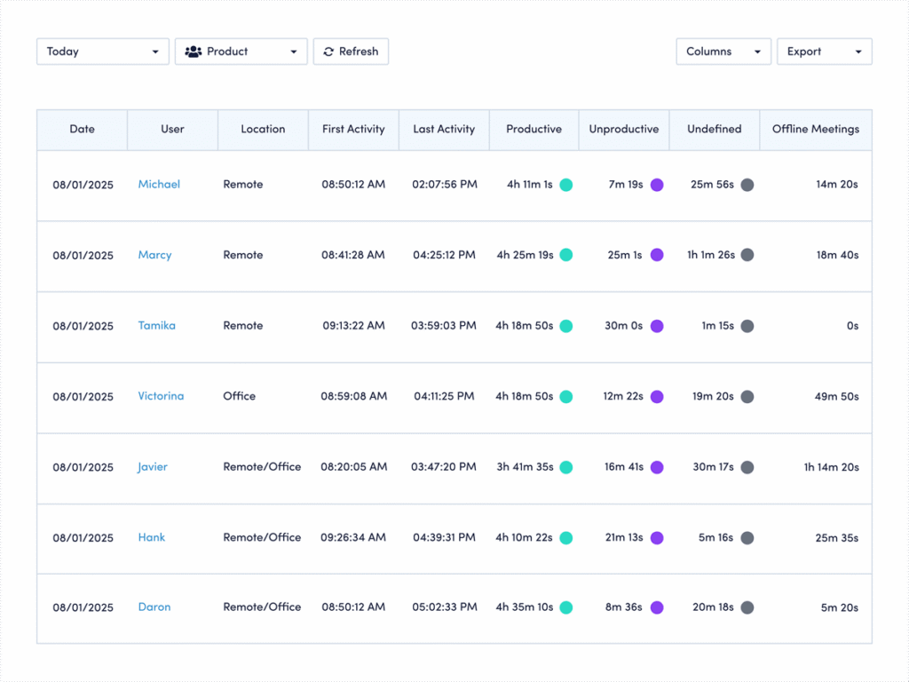
How to compare your data: Use ActivTrak’s Daily Work Metrics dashboard:
- Navigate to Workforce Management > Daily Work Metrics (or Live Reports > Working Hours if you’re using legacy navigation).
- Under Date Range select “Last Month.”
- Click the + Filters button and check the box next to “Schedule Days.”
- Under the Schedule Days box that appears, select “Non-Workday.”
- View the “Work Time” column on the far right to see who works on Saturdays and Sundays, and for how long.
How to interpret the data: Weekend work patterns reveal whether you’re seeing isolated spikes or deeper trends that need attention.
This view gives you a clear picture of who’s working on weekends, how often it happens and how much time they log. But the real value comes from spotting patterns, not outliers. Start by scanning for consistency. Are the same employees showing up week after week, or is weekend work spread across the team? Consistent patterns may point to workload imbalance or role-specific demands, while occasional spikes may reflect deadlines or seasonal pressure.
Next, look at the volume of time. A quick check-in on Saturday morning tells a very different story than several hours both days every weekend. From there, expand your view. Adjust the date range to the past quarter or year to see if this behavior is persistent or temporary. If it’s ongoing, it’s worth a closer conversation about capacity, priorities or schedule flexibility. If it’s sporadic, you may be looking at a healthy redistribution of work. Either way, this data helps you move from assumption to clarity and respond with intention instead of guesswork.
2. How much of that weekend time is productive?
The finding: Employees aren’t just working weekends more often. They’re spending significantly more weekend time on productive work.
Weekend productivity rose sharply over three years. On Saturdays, productive time increased 46%, from 3 hours 10 minutes to 4 hours 37 minutes per worker. Sundays show an even bigger jump, with productive time up 58%. In other words, this isn’t passive or incidental activity. When employees work weekends, they’re getting meaningful work done — contributing focused, measurable output rather than just checking messages or staying loosely connected.
Why it matters: Weekend productivity reveals how and when employees do their most focused work.
For many employees, weekends offer something the workweek often doesn’t — uninterrupted time. Fewer meetings, fewer messages and fewer context switches make it easier to focus on deep work that moves projects forward. This may help explain both the earlier start times and the rise in productive hours. It also points to a broader shift in how work gets done, with more employees breaking the workday into flexible blocks to accommodate personal responsibilities. Surveys show 60% of employees schedule personal appointments during traditional work hours, which may also help explain the shift to more work on the weekends.
How to compare your data: Use ActivTrak’s Daily Work Metrics dashboard:
- Navigate to Workforce Management > Daily Work Metrics (or Live Reports > Working Hours if you’re using legacy navigation).
- Under Date Range select “Last Month.”
- Click the + Filters button and check the box next to “Schedule Days.”
- In the Schedule Days filter box that pops up, select “Non-Workday.”
- View the “Productive” column to see how much of the time spent on weekend work goes to using productive apps and sites.
How to interpret the data: Productive time shows whether employees use the weekend for meaningful output or to stay lightly connected.
This view helps you understand how much of your team’s weekend work is truly productive. If you see high productive time on weekends, it’s a signal employees need that time to move work forward. If not, they may use it to catch up on messages and prepare for the week ahead. From there, compare patterns across roles or individuals and over longer time periods to understand whether this is a consistent behavior or tied to specific deadlines. If it’s consistent, look for ways to protect that focus time during the week. If it’s occasional, it may reflect a healthy, flexible approach to getting work done.
Remote work benchmarks
If you have employees who work from home, it’s important to compare your numbers to the latest remote work benchmarks:
1. What is your remote-only status?
The finding: Remote-first is now the dominant workforce model.
Nearly half of organizations (47%) currently operate as remote-first, making this the most common workforce model today. That’s nearly double the share of office-first or structured hybrid models, each at 25%. In addition, remote-first companies have the highest share of employees in a healthy utilization range at 76%. This data suggests distributed teams are finding ways to balance productivity and workload effectively by allowing at least some employees to work from home full-time.
Why it matters: Knowing where employees work helps you design the right work structure.
Monitoring how many employees are fully remote, especially at enterprise organizations where it’s harder to track thousands of workers, is important. Why? Because it allows leaders to prepare for both opportunities and risks. On the one hand, 31% of fully remote employees are likely to be engaged — more than hybrid and on-site workers. On the other, only 36% describe themselves as truly thriving. They’re also more likely to be actively job hunting. This contrast highlights a key point: Knowing where your employees work, and where they work most often, allows you to create the support and conditions they need to perform their best.
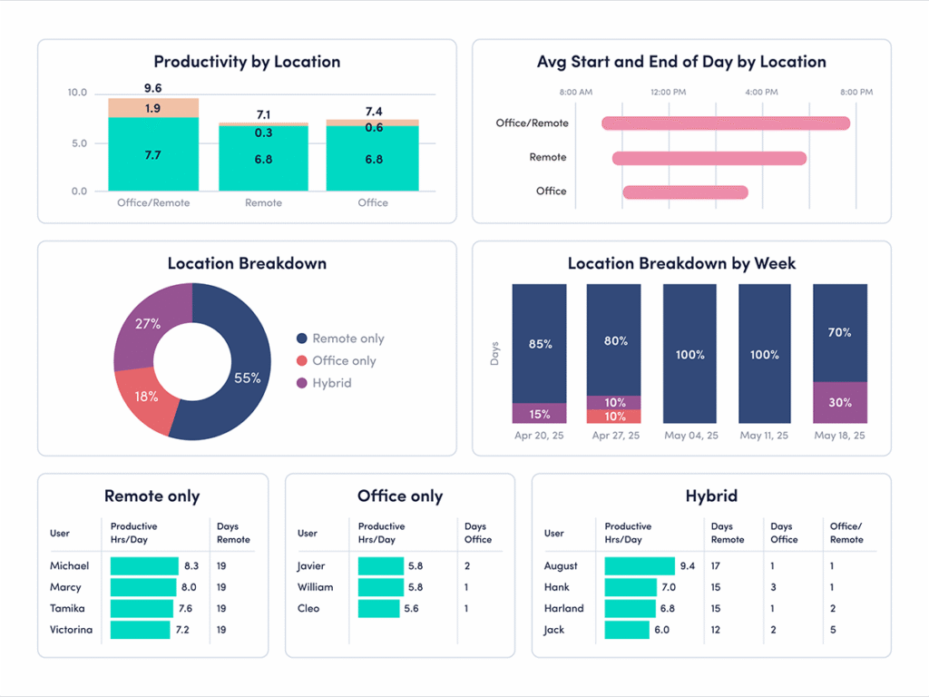
How to compare your data: Use ActivTrak’s Productivity by Location dashboard:
- Navigate to Productivity Optimization > Productivity by Location.
- Change Activity Date to “Last 180 Days.”
How to interpret the data:
- If more than half of employees are remote-only: Your organization leans heavily into remote work, and is above the latest cross-industry benchmark. This flexibility can support efficiency — but it also requires strong systems for communication, alignment and engagement. Pay close attention to how work gets done, not just where it happens.
- If less than half of employees are remote-only: Remote work plays a smaller role in your operating model compared to the latest benchmark. That’s not a disadvantage, but it does mean your results may be driven more by in-office or hybrid dynamics. Compare performance across work types to understand what’s working best.
- If 47%-50% of employees are remote-only: You’re aligned with the current benchmark, but it’s important to look beyond the percentage. Identify which teams perform best in a remote setting, and what conditions help them succeed, so you can apply those insights more broadly.
2. How many hours a day are your remote employees productive?
The finding: Remote employees log the most productive time.
Across industries, the latest benchmark shows remote-only employees average 7 hours 1 minute of productive time per day. That’s 38 minutes more than office-first employees. They also record the longest uninterrupted work sessions, with remote-first organizations averaging 33 minutes of focused, productive work stretches. This suggests remote environments may better support sustained, distraction-free work.
Why it matters: Remote work can improve focus, but only with the right structure.
Remote environments often reduce common workplace interruptions, giving employees more time to focus on meaningful work. Fewer in-person disruptions and more control over the workday often leads to longer productive sessions and higher output. But these gains aren’t automatic. Without clear expectations and strong communication practices, remote work can just as easily lead to overwork or blurred boundaries. The key is understanding how productivity shows up in your environment — and ensuring it’s both effective and sustainable.
How to compare your data: Use ActivTrak’s Productivity by Location dashboard:
- Navigate to Productivity Optimization > Productivity by Location.
- Change Activity Date to “Last 180 Days.”
How to interpret the data:
- If remote-only employees average more than 7 hours of productive time a day: Your remote teams are above the current benchmark for productivity. That’s a strong signal, but it’s worth looking deeper. Are employees maintaining healthy work patterns, or is higher output tied to longer days and fewer breaks? Sustainable productivity should balance output with well-being.
- If remote-only employees average less than 7 hours of productive time a day: This average is below the current benchmark, and may point to gaps in focus, communication or workflow clarity. Look for friction points — unclear priorities, too many tools or interruptions — and address them to help employees stay on track.
- If remote-only employees average 7 hours of productive time a day: You’re aligned with the current benchmark. The next step is optimization. Break this data down by team or role to see where remote workers perform best and where there’s room to improve. Focus on maintaining consistency across your workforce.
Hybrid and in-office benchmarks
While 47% of organizations operate as remote-first, the other half have hybrid or in-office models. That means millions of employees still spend at least part of their week working on-site, making it just as important to understand how they impact productivity.
For this benchmark comparison, we’ll focus on one key finding and show you how to drill down further to get the full picture with your ActivTrak data:
Is your organization predominantly office-first or regular hybrid?
The finding: Office-first and hybrid organizations now represent half of all workforce models.
One-quarter of organizations operate as office-first, and 25% follow a regular hybrid model. While remote-first work receives much of the attention, hybrid and in-office environments continue to play a major role in how work gets done.
Why it matters: Knowing your model is the start. Understanding how it shapes performance is what drives better decisions.
While many leaders still wrestle with the return-to-office question, the more important thing to ask yourself is whether your operating model gives employees what they need to do their best work. Your ActivTrak data helps you answer questions like:
- How do productivity and utilization metrics differ across work locations?
- What are the real tradeoffs between remote, hybrid and in-office work at your organization?
How to compare your data: Use ActivTrak’s Productivity by Location dashboard:
- Navigate to Productivity Optimization > Productivity by Location.
- Change Activity Date to “Last 180 Days.”
Next, let’s look at how productivity and work patterns vary between in-office and hybrid employees — and what those differences may tell you.
How to interpret the data for in-office environments
Looking at your overall work model is a good starting point, but the real insights come from drilling down deeper. Here’s what the data says about office-first and office-only employees, and where to look next.
The finding: Office-first companies have the highest share of underutilized employees at 20%.
How to compare your ActivTrak data: If your organization leans office-first, this is one of the most important numbers to cross-reference. Underutilization may signal disengagement, and disengagement has a real cost. When employees consistently work below capacity, engagement and productivity decline. This is especially true for chronically underutilized employees, who spend more than 75% of their work year under-challenged and under-deployed.
Revisit part four to see if your employees are at or above the 20% underutilization benchmark. Pay particular attention to which teams or roles show the lowest utilization, since in-office environments may mask disengagement in ways remote setups often can’t. The goal isn’t just to increase activity — it’s to ensure employees have meaningful, balanced workloads that make full use of their skills and time.
The finding: Office-only workers have the highest focus efficiency at 64%.
How to compare your ActivTrak data: This benchmark suggests office environments may support focused work more effectively than many leaders assume. But focus efficiency doesn’t happen automatically. It’s shaped by factors like collaboration overload, multitasking and frequent interruptions.
Revisit part three to compare focus efficiency against collaboration and multitasking trends inside your organization. This helps you understand whether office employees work efficiently or spend more time navigating interruptions.
The finding: Office-only workers have the longest average productive sessions at 41 minutes.
How to compare your ActivTrak data: Long productive sessions indicate employees have uninterrupted time to concentrate and make meaningful progress. In-office employees currently lead in this area. To see how your organization compares to this benchmark, revisit part two.
Compare productive session length alongside meeting patterns, collaboration habits and workload balance to identify which conditions help employees stay focused longest — and how those conditions differ across work environments.
How to interpret the data for hybrid setups
Hybrid work looks different depending on how you measure it. The Productivity by Location dashboard shows you the surface-level split — but to understand what’s actually happening with your hybrid employees, you need to dig into the details. Two findings in particular are worth your attention.
The finding: Hybrid workers — those splitting a single day between office and remote — have the longest workdays at 9 hours 45 minutes.
How to compare your ActivTrak data: A longer workday doesn’t automatically mean teams get more done. It may signal more fragmentation: Employees start work in one environment, continue it in another and struggle to fully disconnect at the end of the day.
Revisit part two to compare workday length alongside productive time, start times and workload balance. This helps you identify whether longer hybrid workdays reflect healthy flexibility or overly heavy workloads.
The finding: Hybrid workers log the lowest productive time and focused hours of any location type.
How to compare your ActivTrak data: This is the finding that should prompt the most questions. Hybrid employees are working the longest days and getting the least focused work done — a combination that points to real friction. Splitting time between locations often means more meetings, more context-switching and less control over the workday.
Revisit part three to compare focus, productivity and collaboration across hybrid teams. Understanding where interruptions happen helps you create better structures for focused work, regardless of location.
Go deeper with the 2026 State of the Workplace report
The 2026 State of the Workplace report offers valuable context, but your own workforce data tells the story that matters most. By comparing these benchmarks to your ActivTrak data, you’ll uncover where your teams are thriving, where friction exists and where small changes help drive meaningful improvements.
With findings from one of the largest workplace behavior datasets ever assembled, this year’s report offers insights to help you understand how work is changing across industries — and where your organization fits.
Read the full report to explore the complete research, discover additional benchmarks and learn how leading organizations are adapting to today’s changing workplace.
This article was originally published on Mar 20, 2026, then updated on Jul 15, 2026