Trusted by 9,500+ global brands and organizations
SaaS management
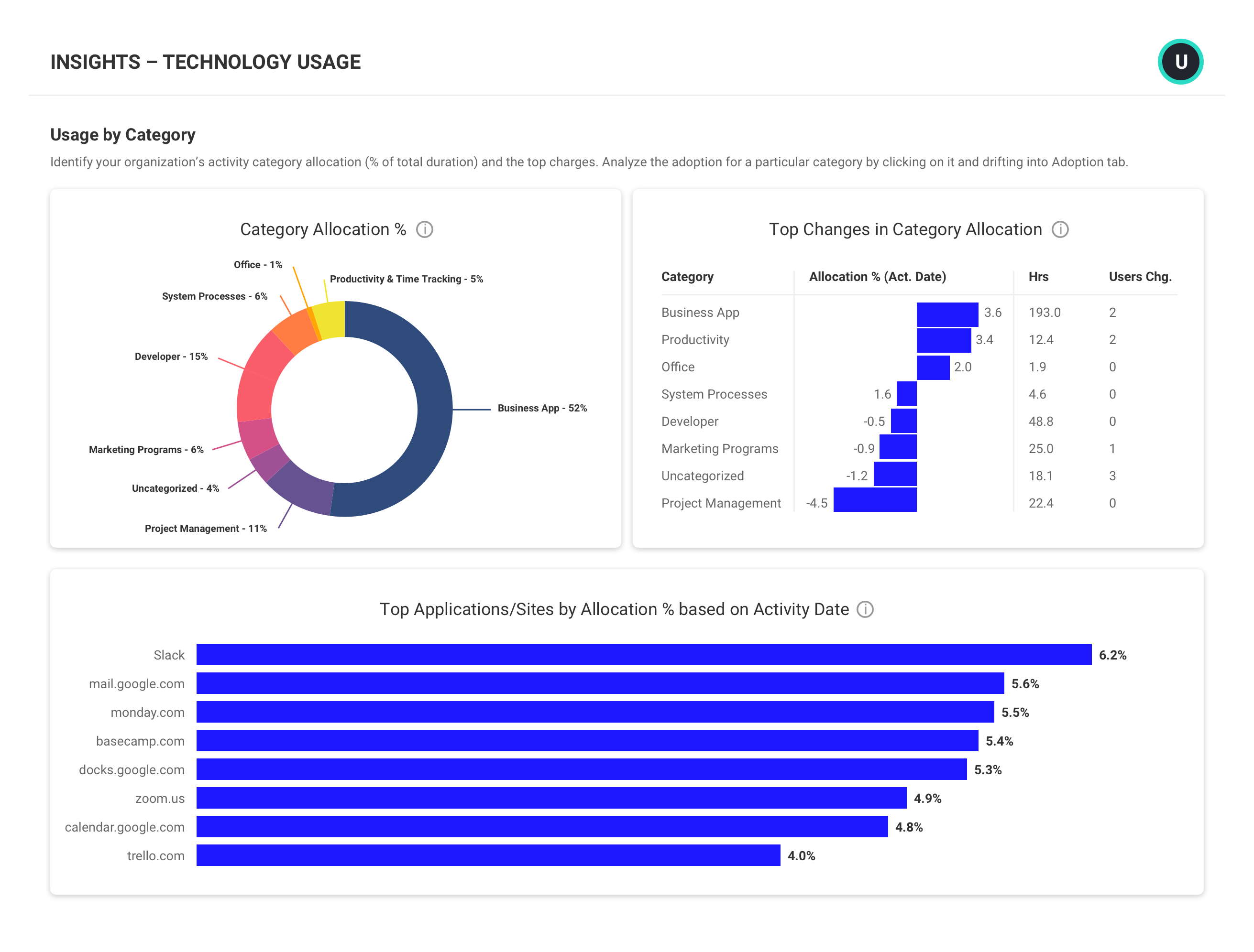
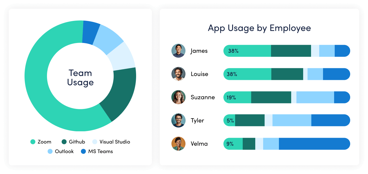
Streamline your SaaS investments
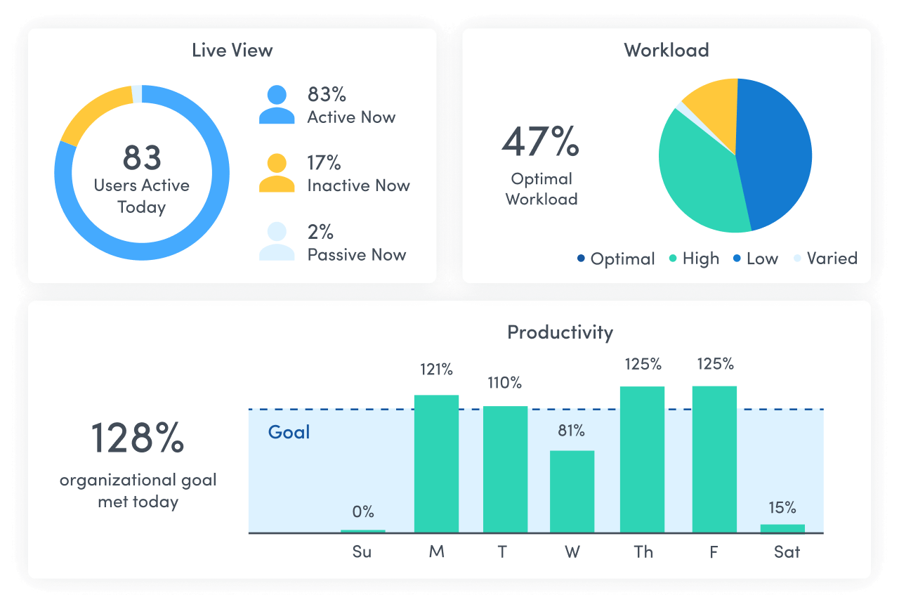
Seeing application adoption, proliferation, and misalignment across an organization can be done many ways through tracking software usage. But understanding how those conditions affect productivity is a greater challenge. ActivTrak takes application usage tracking a step further to deliver insights into how applications hinder or serve productivity, to help you uncover ways to streamline and save across your application stack.
Learn how ActivTrak can help you:
- Gain control of SaaS application sprawl
- Shore up security gaps
- Reduce application management overhead

– Bill Nash, Operations Support Manager Nason, Yeager, Gerson, White & Lioce P.A
December 12, 2020
SOFTWARE USAGE TRACKING
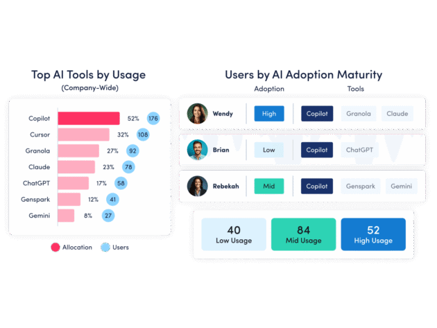
Get control of SaaS application sprawl
- Uncover which applications and tools are widely adopted and productive.
- View usage insights to drive decisions around subscription renewals and license purchases.
- Identify inactive accounts, unallocated or unused licenses, and apps with overlapping functionality.
SaaS management can go beyond just seeing what is where. With ActivTrak, you can view how application usage relates to productivity and make choices that serve productivity goals.
Explore tracking software usage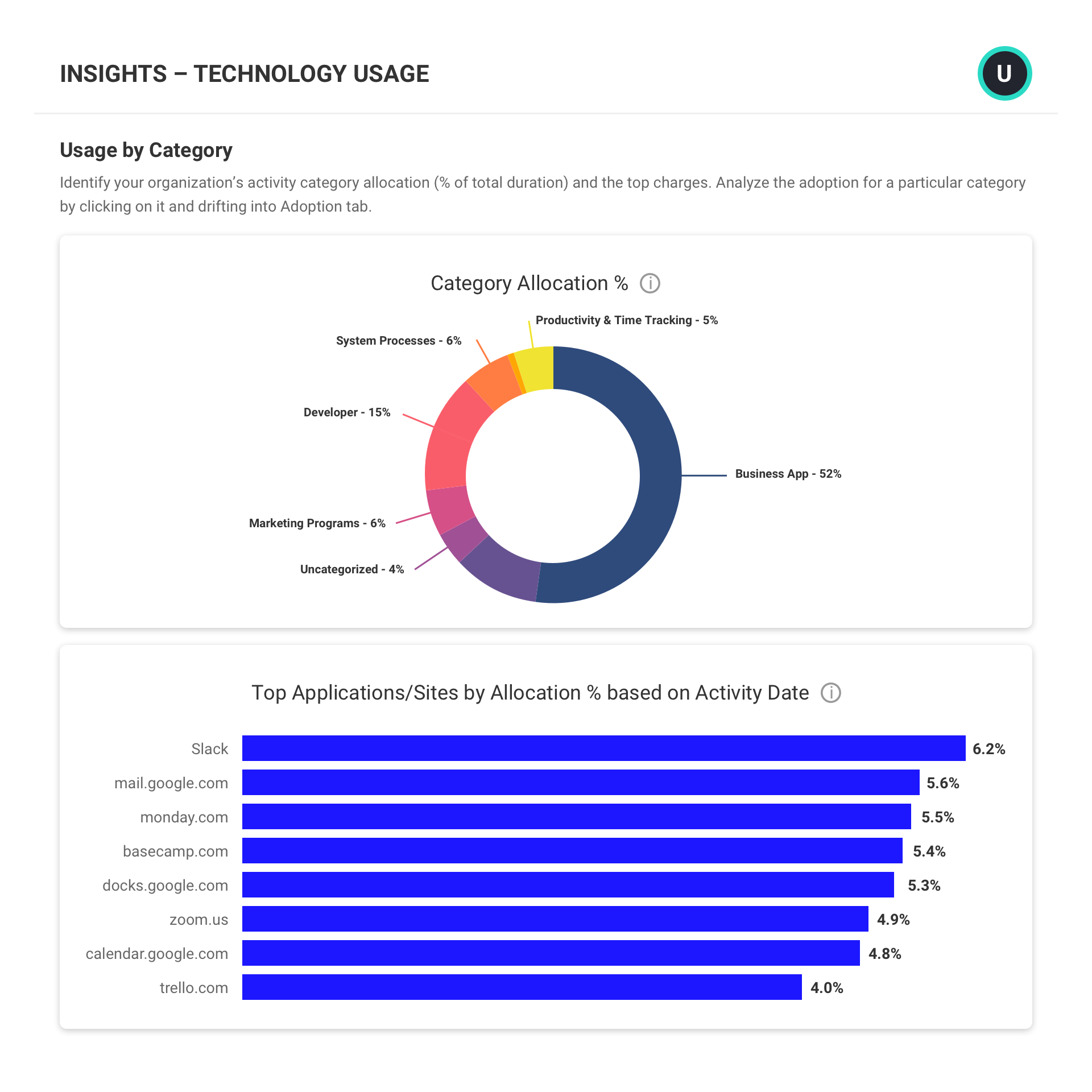
PRIVACY & SECURITY
Shore up security gaps
- Uncover applications that fail to meet privacy and security requirements
- Automatically block or terminate applications that pose a malware risk
- Identify applications with overlapping functionality to identify cost saving opportunities.
- See if and when new applications are introduced into your environment and set custom limits.
It’s important to understand which applications fail to meet privacy and security standards needed by your business. But also understanding how applications that meet those requirements are being used, by whom, and from where is also critical to ensure data is safe and secure.
Explore privacy & security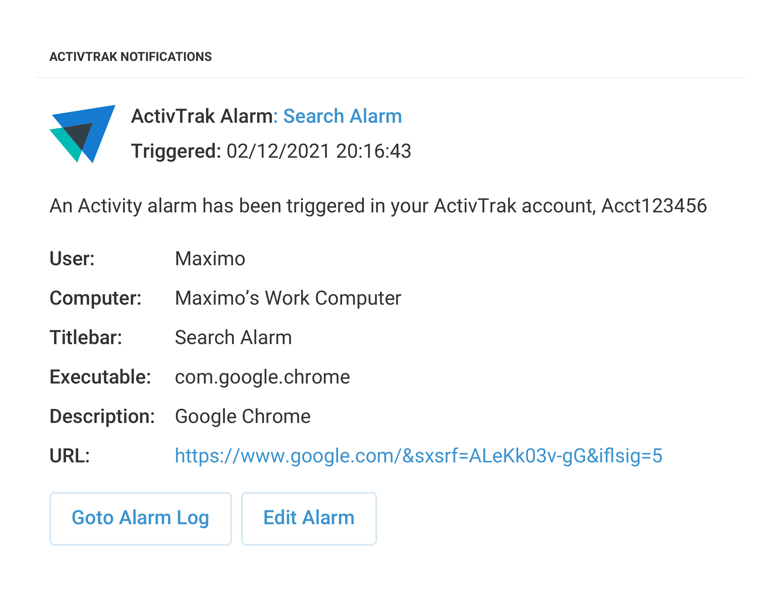
ALARMS
Reduce application management overhead
- Use pre-built alarms for common activities such as USB device use, unauthorized file sharing, access of blocked domains, and user deletion from computers.
- View user activities and configure automated actions based on user risk scores, risky activities, or actions of interest.
- Trigger real-time alarm notifications in Slack, MS Teams, or a custom webhook URL.
ActivTrak’s customizable alarms monitor user activity and trigger notifications when specific behavior occurs, reducing the need for constant and active application management. ActivTrak’s ability to modify alarms at the department, team, individual, or company-wide levels prevents painting with a broad brush and safeguards against heavy oversights.
Explore alarms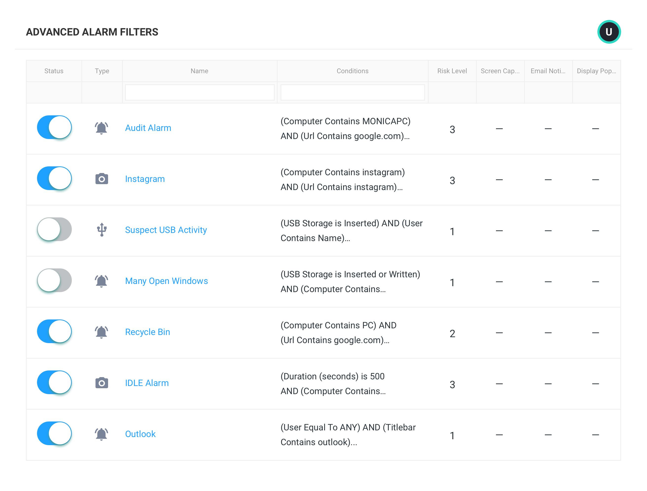
What you can do with ActivTrak
ActivTrak gives you the work intelligence to understand how work happens across people, tools and AI. Measure productivity, improve efficiency, and see how AI is changing workflows—so you can improve performance across your organization.
Executive Insights
Transform workforce data into boardroom-ready insights. See cross-team performance, identify hidden cost savings and make confident decisions that drive measurable business outcomes.
AI Insights
Understand how tools — and AI — are shaping work. See how applications and AI tools are used. Identify what’s driving value, where licenses are underused and how workflows are evolving.
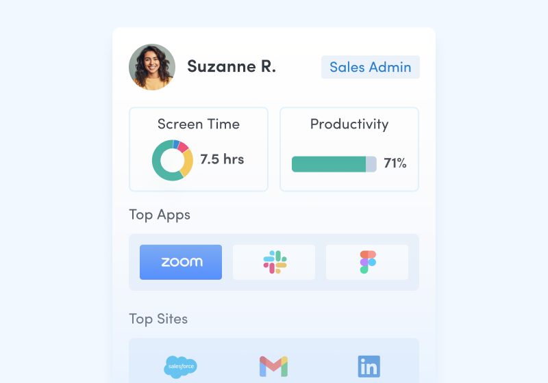
Workforce Management
Understand how work happens across your organization. Analyze work patterns across teams, roles and tools to see where time goes, where friction exists and where performance can improve.
Productivity Optimization
Improve performance with data-driven insight. Quantify productivity, identify capacity and help teams work in more effective, sustainable ways.
Technology Usage & Compliance
Optimize technology investments and ensure compliance. Understand which applications and websites employees use to drive adoption or cut costs, and enforce policies aimed at mitigating risk.
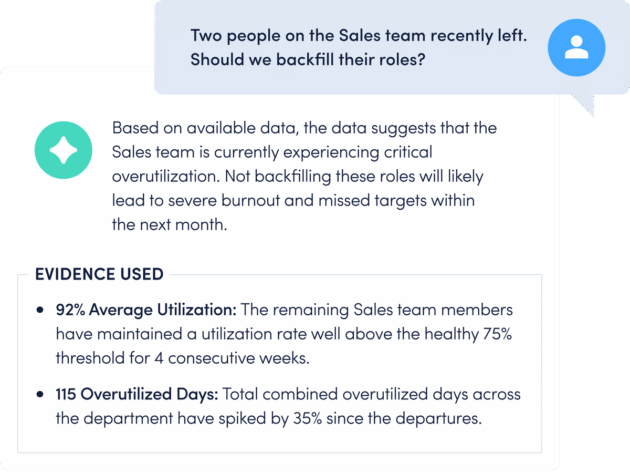
Work Advisor
Let ActivTrak’s conversational AI assistant pull directly from your data for evidenced-backed answers to pressing questions. Skip the manual analysis and get instant insights on work habits, staffing needs, attendance and more.
Connect work intelligence across your tech stack
Integrate existing tools to combine workforce activity, AI usage and business data for deeper, more actionable insights.
Workday
ADP

Microsoft Teams
Outlook

Google Calendar
ServiceNow
Zendesk
ChatGPT
Claude
Gemini
Microsoft Viva
Jira Software
Salesforce
Slack
How It Works
Capture behavioral activity
Capture behavioral activity including hours worked, schedule adherence, location policy compliance and app & website usage.
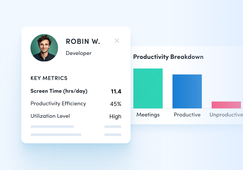
Analyze productivity trends
Analyze productivity trends on employee focus, engagement and utilization to make data-informed decisions on resource allocation.
Optimize team performance
Optimize team performance with benchmarks, goal-tracking and AI coaching recommendations to improve workforce productivity.
See what customers say about ActivTrak
Powered by![]()
Getting started is easy. Be up and running in minutes.
Frequently asked questions about SaaS management
How do you measure software usage?
Increasing productivity is always top of mind for organizations and one key way to ensure an increase in productivity is tracking software usage. It can be difficult to measure whether or not your company is effectively using their technology stack and when done poorly, it can result in wasteful spending.
By measuring software usage you can identify areas of improvement, manage workloads across teams, reduce costs, and increase ROI. Be sure to track software renewals. By doing so, you keep a constant pulse to measure if that particular software application is really worth the money. Application usage tracking software can help you tie together spend data, renewal data and usage data to help optimize spend.
Also be sure to understand how many software licenses you have versus how many are actually being used. Often, shiny new software applications get introduced to the business and are forgotten about. Eliminate wasteful SaaS spending by identifying inactive accounts, unallocated or unused licenses, and software with overlapping features and functionality.
Always reevaluate your technology or software stack to understand if your employees find the software easy to use and helps them be more productive, assess reliability of the applications, and determine if each tool in your stack helps your company achieve business goals.
What is software utilization?
Software utilization is the data that is collected to help businesses optimize software license costs. Application usage tracking software collects and analyzes software usage data to keep the business informed of what software is really being used by individuals and teams.
Understanding software utilization helps you determine if software is being unused or underutilized, identify the unauthorized use of software to determine if it should be stopped, identify new opportunities for cost savings, support security and compliance efforts to minimize risk, and much more.